What is a TabRow?
Also Read How to create a card in jetpack compose
Tab is a useful components in material design to represent a single page of content using a text label and/or icon. Fixed tabs display all tabs in a set simultaneously. A default Tab, also known as a Primary Navigation Tab. Tabs organize content across different screens, data sets, and other interactions. Tabs should be used inside a TabRow.
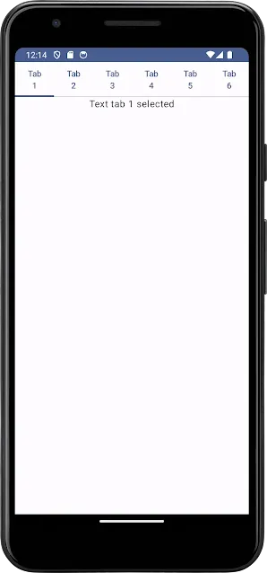
A TabRow contains a row of Tabs, and displays an indicator underneath the currently selected tab. A TabRow places its tabs evenly spaced along the entire row, with each tab taking up an equal amount of space.
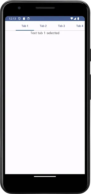
ScrollableTabRow is a tab row that does not enforce equal size, and allows scrolling to tabs that do not fit on screen. So, if we have more tabs in TabRow that do not fit in a small screen size devices we should use ScrollableTabRow.
In this tutorial we will learn to create tabs in Jetpack Compose.
Create a New Project and select Empty Activity. In my case, application name is Coding Bihar you can use any other name.
Now we have MainActivity
MainActivity
Copy this code →
package com.example.codingbihar

import android.os.Build
import android.os.Bundle
import androidx.activity.ComponentActivity
import androidx.activity.compose.setContent
import androidx.annotation.RequiresApi
import androidx.compose.foundation.layout.fillMaxSize
import androidx.compose.material3.MaterialTheme
import androidx.compose.material3.Surface
import androidx.compose.ui.Modifier
import com.example.codingbihar.ui.theme.CodingBiharTheme

class MainActivity : ComponentActivity() {
    @RequiresApi(Build.VERSION_CODES.O)
    override fun onCreate(savedInstanceState: Bundle?) {
        super.onCreate(savedInstanceState)
        setContent {
            CodingBiharTheme {
                // A surface container using the 'background' color from the theme
                Surface(modifier = Modifier.fillMaxSize(),
                    color = MaterialTheme.colorScheme.background) {

                    TabsSample()

                }
            }
        }
    }
}
Create a separate file for Tabs and named it as TabsSample
TabsSample
Copy this code →
@Composable
fun TabSample2() {
    var state by remember { mutableStateOf(0) }
    val titles = listOf("Tab 1", "Tab 2", "Tab 3", "Tab 4", "Tab 5", "Tab 6")
    Column {
        TabRow(selectedTabIndex = state) {
            //TabRow(selectedTabIndex = state) {
            titles.forEachIndexed { index, title ->
                Tab(
                    selected = state == index,
                    onClick = { state = index },
                    text = {
                        Text(
                            text = title, maxLines = 2,
                            overflow = TextOverflow.Ellipsis
                        )
                    }
                )
            }
        }
        Text(
            modifier = Modifier.align(Alignment.CenterHorizontally),
            text = "Text tab ${state + 1} selected",
            style = MaterialTheme.typography.bodyLarge
        )
    }
}
OUTPUT :

ScrollableTabsSample
Copy this code →
@Composable
fun ScrollableTabSample() {
    var state by remember { mutableStateOf(0) }
    val titles = listOf("Tab 1", "Tab 2", "Tab 3", "Tab 4", "Tab 5", "Tab 6")
    Column {
        ScrollableTabRow(selectedTabIndex = state) {
            //TabRow(selectedTabIndex = state) {
            titles.forEachIndexed { index, title ->
                Tab(
                    selected = state == index,
                    onClick = { state = index },
                    text = {
                        Text(
                            text = title, maxLines = 2,
                            overflow = TextOverflow.Ellipsis
                        )
                    }
                )
            }
        }
        Text(
            modifier = Modifier.align(Alignment.CenterHorizontally),
            text = "Text tab ${state + 1} selected",
            style = MaterialTheme.typography.bodyLarge
        )
    }
}
OUTPUT :


